“Creative Life JMJ” - the brand
Creative Life JMJ is a tag I created years ago that developed into a goal for myself and inspiration for a community to find creativity in life. Since this is my own brand, I wanted it to reflect my happy, calm nature and have an artistic yet modern feel.
My logo went through various stages with my initials “JMJ” as always the focus because I sign my art with the same swooping, combined “JMJ’ letters.
For my flow, I begin by drafting many sketches and research inspirations for my brand identity. When I work with clients I note their audience, words that they feel describe their brand, and their own vision for their organization. I did the same for myself when designing my logo and choosing the fonts and colors.
A pastel, muted mint and pink balanced each other to have a feminine and slightly masculine feel to represent the contrast in my work I enjoy and also the different members I have in my community. These colors also have a relaxed positive tone I want my viewers and clients to feel as we communicate and work together.
“Star Rider” - Game in Development
Logo I developed for a 3D action shooter game currently in development.
Sidewinder Squadron China Lake
Logo for youth organization of the US Naval Cadet Corps located in Ridgecrest, CA .
Shadoe Fox Sound
Logo commission for sound brand.
“The Dastardly Dairy Debacle”
“The Dastardly Dairy Debacle” is a mobile role playing game released on Android, produced by Whim Independent Studios LLC.
For this game among being the artist, I also designed the logo. This is a vibrant, fun, humorous game centered around saving a cow. When creating the logo, I followed my flow of drafting various sketches, researching other similar games, and asking who is my audience (older children to young adults), the tone of the game, and if there was anything the studio envisioned for the logo. We also wanted a specific icon that can easily be noticed and we could use for the app icon. The enemy of the game stole of the cow for her milk, so the idea of milk was also an important aspect that is reflected in the color and font design.


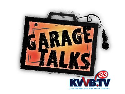
“Garage Talks”
“Garage Talks” was a satellite TV and online music show that aired in 2016. The team wanted a grungy, music type logo to display at the lower right hand corner of the video frame, and for any promotion online posts about the show.


